Nexqario
Arc Layout
Arc Layout
Couldn't load pickup availability
1. Problem Statement
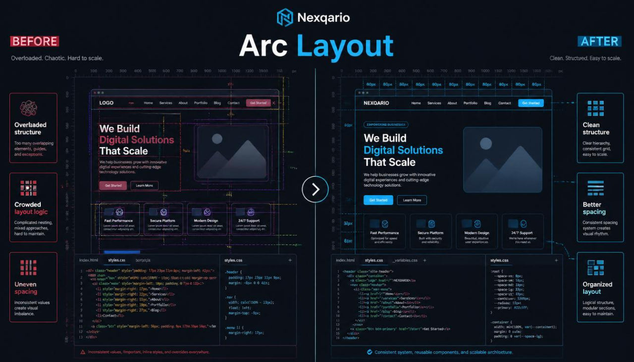
Many learners can review interface patterns and user journeys, yet layout composition can still feel difficult to control. A page may contain the right sections, useful text, and clear actions, but the overall structure may feel uneven when spacing, alignment, scale, and grouping are not handled carefully. Learners may also find it challenging to decide where each section belongs and how much visual weight each part should carry. Without a layout-focused study method, interface work can become crowded, disconnected, or hard to explain. Arc Layout was created to help learners study composition as a deliberate part of UI/UX practice.
2. Solution
Arc Layout gives learners a focused study path for understanding how page structure works. The course materials guide learners through layout grids, section rhythm, spacing systems, visual weight, content grouping, and screen balance. Each module helps learners examine how interface elements relate to one another and how those relationships shape the user’s reading experience. Learners practice reviewing page layouts, sketching section arrangements, and writing design notes that explain why a layout choice may need revision. This tier helps turn layout study into a calmer, more structured process.
3. What’s Inside
Arc Layout includes a detailed collection of UI/UX learning materials focused on layout structure and composition. The tier begins with an orientation section that introduces layout as more than visual arrangement. Learners study layout as a way to organize information, guide attention, and create a readable path through a screen. This opening section helps learners understand why placement, spacing, and grouping matter before detailed styling begins.
The first module focuses on layout foundations. Learners study basic composition principles such as alignment, spacing, grouping, scale, and section order. The materials explain how interface elements form relationships on a page. A heading may introduce a section, a paragraph may add context, a card may group related details, and an action area may guide the next step. Learners practice identifying these relationships in sample layouts and writing notes about what feels connected or separated.
The second module explores visual hierarchy in deeper detail. Learners examine how size, contrast, placement, and spacing influence what a person notices first. The module shows how too many competing elements can make a page harder to scan. Learners review sample sections and identify where attention is scattered, where the main idea needs more space, and where supporting details should feel quieter.
The third module focuses on spacing systems. Learners study how consistent spacing can make a layout feel more organized. This section explains the difference between spacing inside a component, spacing between related elements, and spacing between major page sections. Learners practice marking spacing patterns and spotting places where inconsistent gaps may create visual noise.
The fourth module introduces layout grids and structural guides. The materials explain how columns, margins, and alignment zones can help organize content. Learners do not need to use named software or technical tools. Instead, the focus is on understanding how grids create order and how layout boundaries help elements feel connected. Exercises guide learners through simple wireframe arrangements using grid-based thinking.
The fifth module studies section rhythm. Learners review how a page moves from one idea to another and how repeated structures can create a smoother reading path. This includes studying hero areas, course summaries, benefit sections, FAQ blocks, contact sections, and learning story sections. Learners practice arranging sections so the page feels calm, balanced, and purposeful.
The sixth module focuses on content grouping. Learners study how to group related information into cards, rows, columns, lists, or short blocks. The materials show how grouping can reduce clutter and help users understand relationships between items. Learners practice taking a dense set of course details and arranging it into clearer visual groups.
The seventh module introduces layout revision. Learners review a sample course page layout and move through a structured revision process. They identify the page goal, mark the main section, review spacing, check alignment, compare visual weight, and rewrite layout notes. This final exercise brings the full tier together and gives learners a reusable method for studying composition.
Arc Layout also includes worksheets for layout observation, hierarchy notes, spacing review, grid sketches, section rhythm planning, and revision mapping. These worksheets help learners document their thinking while reviewing interface ideas. The materials are designed to help learners return to the same method across different UI/UX exercises.
The closing section invites learners to create a small layout study board using their own notes. They can collect section ideas, spacing observations, and composition sketches. This helps learners build a personal reference for future course practice while staying focused on structure, clarity, and thoughtful design choices.
4. Who Is This For?
Arc Layout is for learners who want to study UI/UX composition with more care. It is suited for people who already understand basic interface ideas and now want to examine how page structure, spacing, and visual rhythm shape the full experience.
This tier may fit learners who enjoy layout sketches, visual organization, and section planning. It can also be useful for learners who often know what content belongs on a page, but feel unsure about how to arrange it. Arc Layout gives them a method for studying placement, grouping, and hierarchy without relying only on instinct.
It is also helpful for learners working with course pages, landing pages, dashboards, information pages, or contact flows. These layouts often need careful structure so the viewer can read, compare, and move through the page without unnecessary friction.
5. What You’ll Learn
- How to study layout as part of UI/UX planning
- How alignment, spacing, grouping, and scale shape interface structure
- How to review visual hierarchy with more detail
- How to identify elements that compete for attention
- How to use spacing patterns to organize page content
- How to think with columns, margins, and alignment zones
- How to arrange sections into a smoother reading flow
- How to group related content into cards, rows, or short blocks
- How to review course pages and information layouts
- How to write layout notes that explain design choices
- How to revise a layout through a structured review process
- How to use worksheets for spacing, hierarchy, grid sketches, and section rhythm
6. 30-Day Refund Terms
For Arc Layout, Nexqario may provide a 30-day refund window according to the store terms shown during checkout and on the refund policy page. Refund requests are reviewed through the support channel and may depend on order status, material delivery conditions, and the terms connected to this course tier. Learners should review the policy details before ordering and contact the Nexqario team with any questions about the course materials or refund process.
Self-paced learning overview
- 📁 Digital file available after purchase
- 🗂️ Long-term availability
- 🔒 Secure checkout
- 🧩 Content updated in 2026
Do I need previous UI/UX knowledge?
Do I need previous UI/UX knowledge?
No previous UI/UX background is required for the beginner-friendly tiers. Each tier is arranged with a clear learning order, so learners can study the material at a comfortable pace and return to key ideas when needed.
What do the course materials include?
What do the course materials include?
Depending on the tier, the materials may include lessons, modules, design prompts, worksheets, layout references, research notes, interface exercises, and guided study tasks. Each tier is shaped around a different depth of learning.
How should I choose a tier?
How should I choose a tier?
Choose a tier based on how deeply you want to study UI/UX at this stage. Free Capsule is a light starting point, while higher tiers move into broader topics, richer materials, and more detailed learning paths.
Share