Nexqario
Luma Guide
Luma Guide
Couldn't load pickup availability
1. Problem Statement
After a first look at UI/UX, many learners understand the basic idea, but they still struggle to turn notes into design decisions. They may notice that a screen feels crowded, confusing, or visually unbalanced, yet they may not know how to explain what is happening. Without a study path, early design practice can become a mix of saved references, unfinished sketches, and disconnected opinions. Learners also need a way to compare choices without relying only on personal taste. Luma Guide was created to help learners build a more thoughtful design habit through guided analysis, layout practice, and user-focused reasoning.
2. Solution
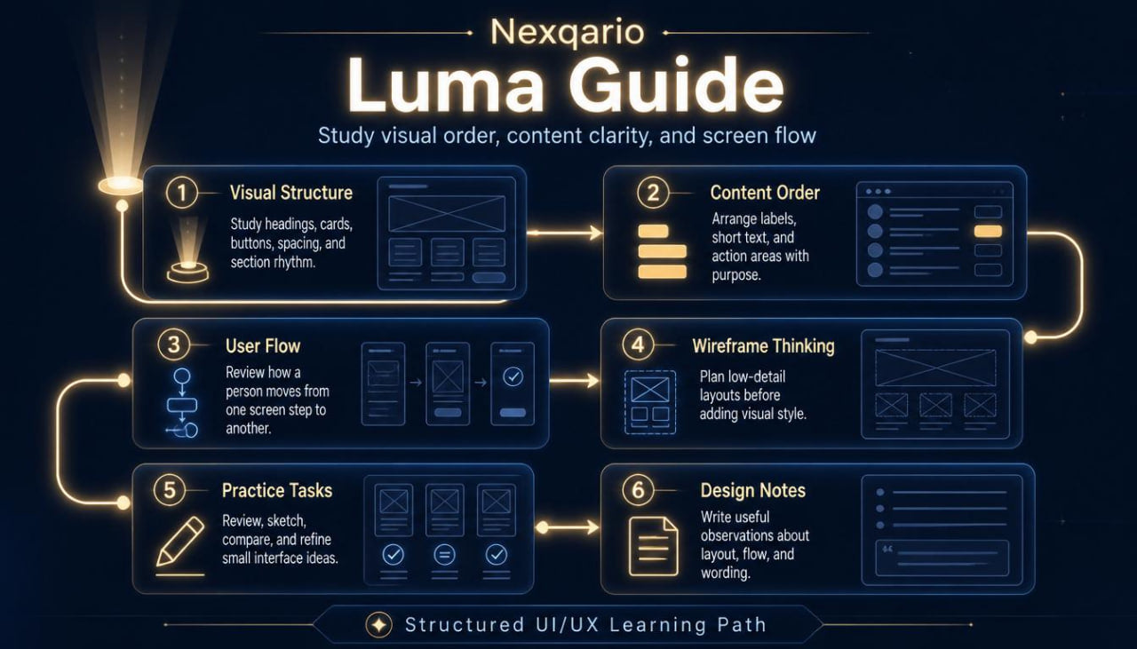
Luma Guide gives learners a structured way to study interface clarity, content order, and interaction flow. The tier breaks UI/UX thinking into small topics that are easier to review, repeat, and apply during practice. Learners examine how visual weight, spacing, labels, buttons, cards, and page sections affect the way a person reads and moves through a screen. The materials encourage learners to write short design notes, compare layout options, and revise simple interface ideas with purpose. By the end of this tier, learners should have a stronger vocabulary for describing design choices and a steadier method for studying UI/UX materials.
3. What’s Inside
Luma Guide includes a carefully arranged set of UI/UX course materials for learners who want a deeper introduction after Free Capsule. The tier opens with a short orientation module that reviews the core ideas from the first tier and then moves into more detailed design study. This opening section helps learners connect observation with practice, so they can begin asking better questions about what appears on a screen and why it appears there.
The first main module focuses on visual structure. Learners study how interface elements can be arranged to create order, rhythm, and readable sections. The materials explain how headings, body text, buttons, cards, icons, images, and empty space work together as a visual system. Instead of treating layout as decoration, this module presents layout as a way to guide attention and reduce confusion. Learners receive prompts that ask them to describe what stands out first, what feels secondary, and where the eye moves next.
The second module introduces content hierarchy. This section explores how written content, labels, and navigation wording shape the user experience. Learners review examples of long text, short labels, action wording, form fields, and section titles. The goal is to understand how language supports design clarity. Learners practice rewriting small pieces of interface text so that each line has a purpose and each section feels easier to scan.
The third module looks at user flow. It explains how a person may move from one screen state to another and why each step should feel connected. Learners study simple flows such as creating an account, browsing course topics, filling out a form, or saving an item. The materials ask learners to identify possible points of friction, missing context, repeated steps, and unclear actions. This section helps learners think beyond a single screen and begin viewing UI/UX as a connected experience.
The fourth module focuses on wireframe thinking. Learners are introduced to low-detail interface planning, where the aim is not visual polish but structure. The course materials guide learners through rough layout sketches, section placement, content grouping, and basic interaction notes. This helps learners separate early planning from final styling. It also encourages them to test the logic of a screen before spending time on detailed visuals.
The fifth module includes guided practice tasks. These tasks may include reviewing an onboarding screen, reorganizing a course page layout, sketching a simple dashboard, or writing notes for a form redesign. Each task includes reflection questions so learners can explain their choices. The focus is on developing a repeatable study method: observe, describe, adjust, and review.
Luma Guide also includes worksheets for design notes. These worksheets help learners document observations about hierarchy, spacing, user flow, and content clarity. They can be used while reviewing examples, studying course materials, or planning small interface ideas. The worksheets are intentionally simple, so learners can return to them throughout the tier.
The closing section brings the modules together with a compact review task. Learners choose a simple interface concept and describe how they would organize its content, guide the viewer, and reduce friction. This final activity is not about claiming a final result. It is about practicing design thinking with more care, more structure, and better language.
4. Who Is This For?
Luma Guide is for learners who have already taken a first step into UI/UX and want a fuller learning path. It is suited for people who enjoy studying how digital screens are built, how content is arranged, and how small design choices affect understanding. This tier may fit beginners who want more than a short introduction, but who are not yet ready for a broad course collection with deeper research and critique work.
It is also a good fit for visual learners who like examples, worksheets, and guided tasks. Learners who often save design references but struggle to explain why a layout works for them may find this tier helpful. Luma Guide gives them language for comparing design choices and a process for turning observation into practice.
This tier can also support learners who want to organize their design study routine. Instead of jumping between unrelated resources, they can follow a calm path that moves from visual order to content hierarchy, then into flow and wireframe planning. It is not built around dramatic claims. It is built around thoughtful study, steady practice, and useful design habits.
5. What You’ll Learn
- How to describe interface layout using more precise design language
- How visual hierarchy affects reading order and screen clarity
- How spacing and grouping help organize page sections
- How labels, headings, and action text shape the user experience
- How to review a simple user flow and identify friction points
- How to plan low-detail wireframes before visual styling
- How to compare layout choices without relying only on personal taste
- How to write short design notes that support later revision
- How to organize UI/UX study into repeatable practice steps
- How to connect observation, structure, content, and flow in one design exercise
- How to use worksheets for design review and course reflection
- How to explain design decisions in a calm, structured way
6. 30-Day Refund Note
For this paid tier, Nexqario may provide a 30-day refund window according to the store terms shown during checkout and on the policy page. The refund process is handled through the store support channel and may depend on order status, material delivery conditions, and the details listed in the policy. Learners are encouraged to review the terms before ordering and to contact the Nexqario team with any questions about the tier, course materials, or refund process.
Self-paced learning overview
- 📁 Digital file available after purchase
- 🗂️ Long-term availability
- 🔒 Secure checkout
- 🧩 Content updated in 2026
Do I need previous UI/UX knowledge?
Do I need previous UI/UX knowledge?
No previous UI/UX background is required for the beginner-friendly tiers. Each tier is arranged with a clear learning order, so learners can study the material at a comfortable pace and return to key ideas when needed.
What do the course materials include?
What do the course materials include?
Depending on the tier, the materials may include lessons, modules, design prompts, worksheets, layout references, research notes, interface exercises, and guided study tasks. Each tier is shaped around a different depth of learning.
How should I choose a tier?
How should I choose a tier?
Choose a tier based on how deeply you want to study UI/UX at this stage. Free Capsule is a light starting point, while higher tiers move into broader topics, richer materials, and more detailed learning paths.
Share